Transparency, a feature available in many illustration and page layout programs for nearly two decades, offers many creative possibilities. However, if not used correctly, it can cause printing problems. So, let's look at the basics of transparency, its uses, and best practices to avoid common issues!
Transparency: Understanding the Basics
Before looking at how to use transparency, it is important to understand the basic concept of what native transparency is and how it works. A key point is that transparency and overprint are not the same thing.
Overprint happens when multiple colors are printed on top of each other, which mixes the colors. For example, printing a cyan circle over yellow creates a green circle on a yellow background. But if the cyan circle is removed from the yellow background, only the cyan circle remains. Overprint and knockout effects are part of the printing process and do not depend on transparency effects in design software.
Transparency, on the other hand, has a different purpose, mainly to create artistic effects such as shadows and feathering. For graphic artists, using transparency offers both visual appeal and practical advantages.
Effects like soft drop shadows, blending modes, and feathered edges let designers create visually rich layouts directly in illustration and page layout programs. This removes the need to build these effects in image editing tools like Adobe Photoshop and then import them.
This smooth integration of transparency features, combined with the option to export designs as print-ready PDF files, makes native transparency a practical, creative, and user-friendly tool.
Common Uses of Transparency
- Feathering: Softens object edges by gradually fading from opaque to transparent over a set distance. This creates smooth transitions and helps objects blend into backgrounds.
- Opacity: Controls how transparent an object is, from fully opaque (100%) to fully transparent (0%). Lower opacity lets background or artwork show through and adds depth.
- Blending Modes: Also called transparency effects, blending modes change how colors mix between objects. Different modes give different results. For example, Multiply darkens colors for shadows, while Screen lightens colors for glow effects.
Designing with Transparency
Using native transparency in designs involves complex processing in the background, especially when multiple transparency effects are applied to one object. For example, a simple drop shadow might use opacity changes, a blend color space, feathering, and more.

Key Considerations
Transparency effects can be applied to many design elements, including strokes or fills on vector artwork. You can apply several transparency effects to one object or a group of objects. You can also add transparency to a document by importing or placing transparent artwork from other applications, which increases flexibility.
However, not all transparency has the same level of complexity. As more transparent objects overlap, transparency processing becomes more complex. Designers should be careful not to create effects that cause unwanted results. For instance, feathering the edges of small serif type can make it hard to read or print. Good judgment is essential when designing with transparency.
Transparency and Final Output
It is recommended to use the PDF/X-4 standard when creating print-ready PDFs, because it keeps native transparency in the file and does not require flattening before output. This lets transparency blending happen smoothly during rendering on RIPs with native PDF interpreters.
While the PDF/X-4 model usually works well, problems can occur with poorly designed transparency effects or if RIPs have limited transparency support. Different RIPs may produce different results, which can cause incorrect output or reduced processing performance.
In all cases, a softmask image is automatically created to control the opacity of transparency effects, such as drop shadows or inner/outer glow edges, to ensure good rendering and output quality.
Best Practices for Using Transparency
When used correctly, native transparency can add creative impact to designs. However, transparency can also cause issues, especially in print projects. By following basic rules and guidelines, you can avoid most of these problems. Here are key practices to help ensure reliable printing of transparent designs:
1 Keep It Simple
Complexity can grow quickly as you add more layers of transparency. Keeping transparency interactions simple helps avoid processing issues. For example, heavy use of transparency, such as combining opacity changes, drop shadows, and gradient fills, can overload processing resources. Aim for simplicity where possible. Instead of stacking many transparent elements, choose clear, simple design solutions.
This is especially important for designs that will be flattened before output. Avoid partially overlapping vector objects with transparency to prevent rendering differences and to keep the appearance consistent between rasterized and vector elements.
2 Considerations on Color Model and Blend Space
Transparency's effectiveness depends on consistent blend spaces across documents and objects. Conflicting or multiple blend spaces can lead to unexpected results, especially with overlapping transparent elements. Keeping transparency blend spaces consistent within a file and across imported/embedded files is essential.
Transparency: Blend Space
Understanding transparency blend space is crucial for maintaining color consistency within a document, especially when blending different color spaces like RGB and CMYK. A blend space is necessary because a document can contain a mix of RGB, CMYK, or Lab colors on the same page, all of which may be blended using transparency effects.
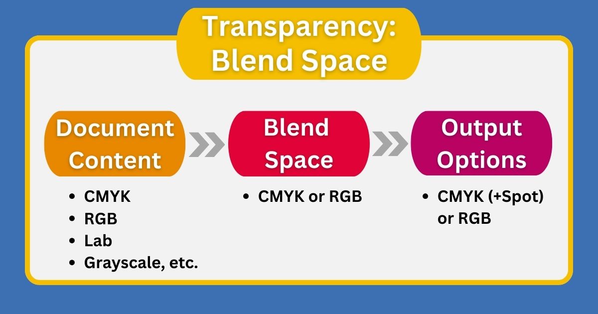
Think of it like working in Photoshop, where combining multiple images produces a single image in one color space. Similarly, the transparency blend space combines different color spaces into one consistent output.
To blend transparent objects, the flattened document must use a single color space (RGB or CMYK) for blending. This space is called the Transparency Blend Space. It is recommended to use the same transparency blend space throughout a document to avoid inconsistencies.
3 Object Order and Stacking
Manage Stacking Order: The order in which objects are stacked affects transparency rendering. Each object, group, or layer has a stacking order that influences how transparency is applied. Changing the stacking order can change how overlapping objects look and how transparency behaves. Align the stacking order with the intended design to avoid unwanted visual differences.
Prioritize Text and Spot Colors: To prevent text and spot colors from being unintentionally affected by transparency flattening, place them at the top of the stacking order. This helps keep them sharp and accurate in the final output, preserving readability and color accuracy.
By following these best practices, designers can use transparency creatively while helping to ensure smooth printing. Careful design choices and adherence to standards support reliable transparent effects and reduce production issues.
4 Transparency for Soft Shadows
Soft drop shadows with translucent edges that let background colors show through depend on transparency. These shadows are not native to PDF, but are created by applications. They are generated as an image containing the shadow, which is then placed with transparency data. The quality of these effects depends on how the bitmap is created in the design application. It is recommended to proof such drop shadows on a hard copy before finalizing designs.
In Conclusion
Native transparency is a powerful tool that improves the design process. Understanding and using transparency correctly can help avoid costly production errors. Best practices for transparency include understanding how it works, knowing the basics of how to apply it, and planning for the file's final use.
Not all transparency is the same, and higher complexity increases the risk of output problems, especially when transparency is resolved in the RIP at output. Finding and fixing such issues before this stage helps keep the workflow running smoothly.